

It’s no secret the Toronto Housing market and real estate has boomed over the last decade and continues to do so. The question we’re so often faced with as investors and end-users alike is: “will Toronto real estate prices continue to appreciate?”
You might also be wondering: Is Toronto in a housing bubble? A relatively straight-forward question given all of the data for the underlying fundamentals is thankfully public. This includes historical sales statistics, new home supply, net population growth, etc.
In this post, we’re going to cover the basics of the Toronto house price growth history. By understanding previous real estate market patterns, this gives an insightful view of what will happen with the Toronto housing market in 2022 and beyond.
Historical Toronto Housing Graph Index:
1. Housing Bubble Example Graph
2. Historical Detached & Condo Median Price in Toronto
3. Supply: New Homes Sold per year
4. Demand: Immigration into Toronto
5. Average Detached Home Price vs Inventory
6. Average Condo Price vs Inventory
7. Mortgage Stress Test Impact
8. Condo Rental Rate inflation graph
“A housing bubble is a run-up in housing prices fueled by demand, speculation and
exuberance.” – Investopedia
It’s important to point out that, naturally, all investors are “speculators”. Unless you get a kick out of losing money, the only reason you’d even consider investing in a given asset class in the first place is based on you ‘speculating’ that the market is going to go up. Therefore, by definition, all property investors are speculators.
The question, then, is do we have too many speculative investors? Moreover, too many investors who are so leveraged that should mortgage rates increase – they’d topple.
Secondly, – is the housing market appreciation fueled by supply and local demand, or are there external factors driving up competition and the Toronto home prices?
Let’s take a look at Toronto’s housing price history and price growth to determine the answer.
Comparing Toronto’s Price History To A ‘Housing Bubble Example’
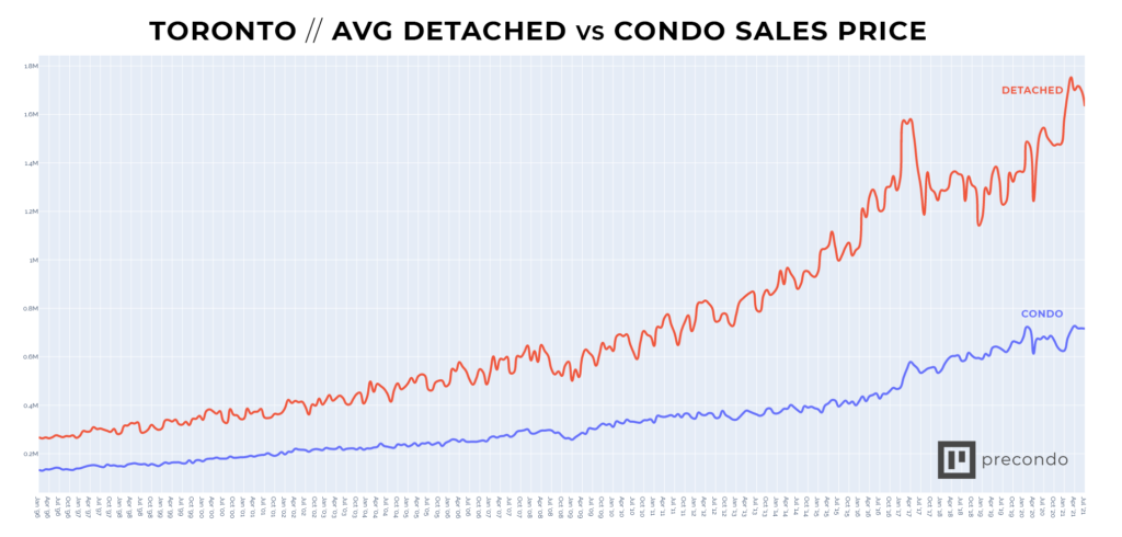
First, take a look at Toronto’s detached and condo price history at the top of the page. Then, compare the detached price to this graph below, a ‘textbook example of a housing bubble’ price trend.
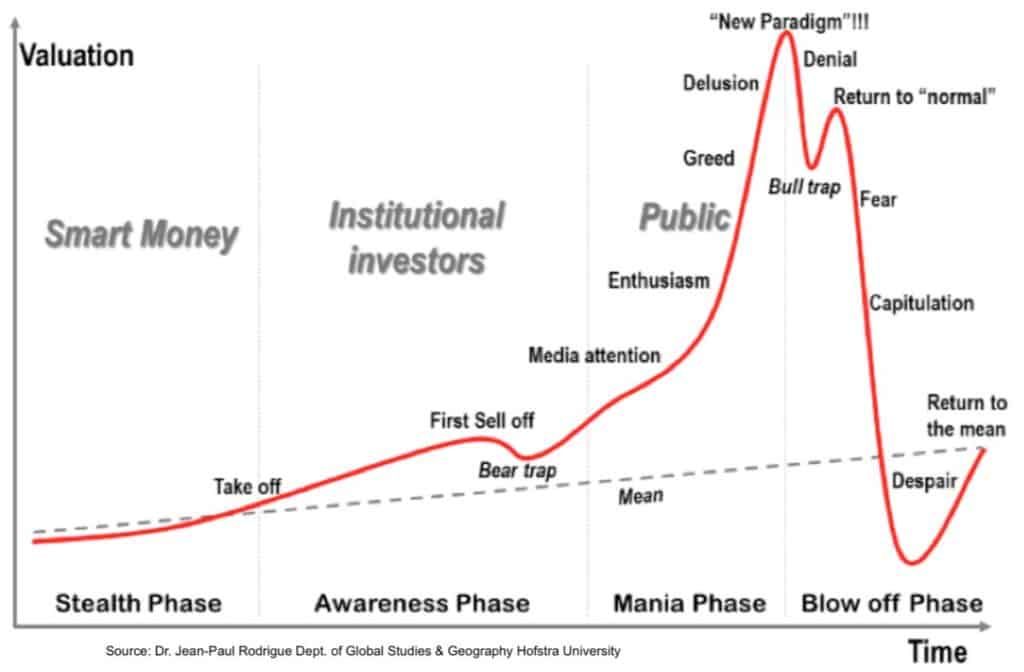
Upon first glance, it would appear we are in a housing bubble, right?! There’s no denying that the detached price trend looks identical to the example here of a bubble. Interestingly, most of the media commenting on this comparison fails to point out two things.
Firstly, that the condo market actually saw a price increase as well as an inventory decrease through the detached dip.
It’s also important to note the obvious – a graph is a way of conveying data in a visual and simple format. They don’t go into further details about the hows and whys of a situation.
For example, take a graph that shows Toronto’s median home price history, historical mortgage rates, inventory levels, and so on. Such graphs do a great job of conveying one or two data-sets in an easy to digest way. They do not, however, show the underlying fundamentals of how the price got there – or why the price dipped.
The above example graph depicts a housing bubble. What you see is that there is a spontaneous dip in price. This is followed by a momentary return to near-peak prices before the bubble ‘pops’.
In Toronto, however, the detached price started to dive at precisely the time that the Fair Housing Plan was announced. It then regressed further as the Mortgage stress test was announced and subsequently implemented. There’s nothing spontaneous about a market change following closely after the government rolls out new legislation taking aim at the housing market.
The Fair Housing plan and the Stress test were the catalysts, or rather the trigger to the price decline in the detached market. (1)
Interestingly, the condo market did not suffer the same price regression. In reality, the Greater Toronto condo market has been bullish since 2016. Whereas, the detached is only started to pick up steam back in 2019. Why is that?
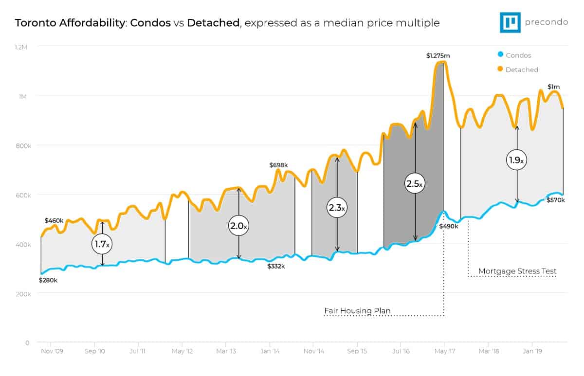
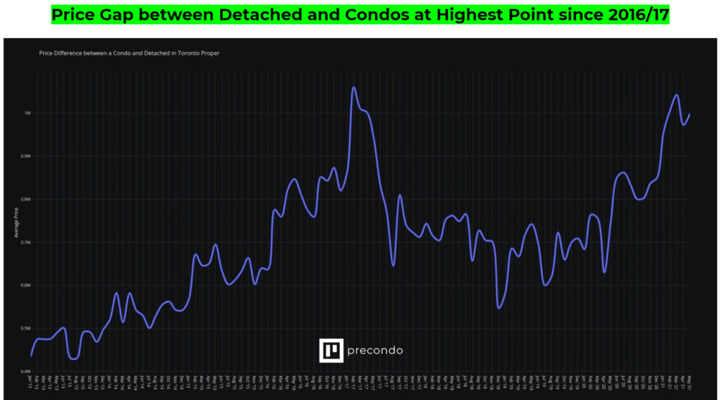
We’ve created a graph for the housing prices in Toronto below. It clearly shows the gap between the median condo price and the median detached price.
You can see how the gap grew aggressively as it became considerably more expensive to own a detached rather than a condo. The trend then reversed after the fair housing plan was implemented.
This is what people so often get wrong with the real estate property market – segments matter. Looking at the housing benchmark median price is highly reductionist and really should only be used as that – a benchmark.
Condos are an entirely different segment than detached, in the same way Hamilton is an entirely different market than Toronto. A $1.5M, a detached Greater Toronto home is an entirely different league to a $500K condo. Often, those markets will perform differently, too. This is due to the introduction of legislation that forces 20-30% of the detached buyer pool into the condo segment overnight by reducing their buying power (mortgage stress test).
The graph below is the one commonly sourced for the ‘housing bubble’ debate. However, it makes this exact mistake of lumping condos and detached together to average them out.
In order to analyze the differences in the condo vs detached market, we have to look a level deeper than price. We also have to look at the fundamentals that drive the price.
Low Supply + High Demand = Housing Appreciation

Also known as Economics 101. Most markets are driven by simple supply and demand at their core, and the housing market isn’t much different.
In Toronto, our rapid condo appreciation has been entirely at the hands of a stagnating supply and an exponential growth in demand.
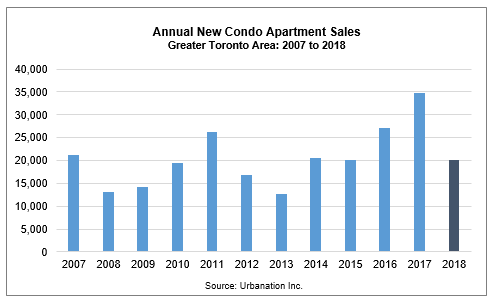
1. Supply: New Condo & Home Completions
Housing Supply is more readily measured and more absolute than demand. It’s simply a question of how many new homes were constructed/completed and added to the market pool in a given year.
The graph below shows new pre-construction condos sold each year. A couple thousand get cancelled a year, and additionally, a few thousand detached get built as well.
All in – we complete ~30,000 new homes each year.
2. Demand: Immigration Growth
Toronto and the GTA, in general, sees a ton of immigration every single year. The influx of residents comes primarily from out of the country but also intra-provincially.
Immigration is by far the strongest indicator of demand. The need for housing increases proportionately to the net population gains. After all, everyone needs somewhere to live.
Ryerson just recently did a study – and the results are wild.
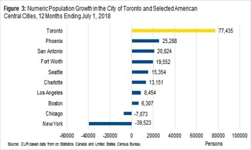
In 2018, Toronto saw some of the highest net population gain in North America.
So, we built 35,000 homes but we gained 77,000 people?
It gets a little crazier still. 35,000 homes are for the GTA – but that 77,000 population growth number? That’s exclusively the City of Toronto – not the GTA.
The immigration into the Greater Toronto Area is 125,000.
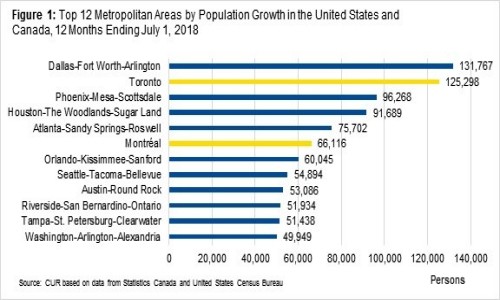
Just to quickly recap: We build roughly 35,000 homes per year but gain 110,000 to 125,000 people.
To break down this housing supply crisis further, we’ve gone ahead and analyzed not just how many new homes are being built, but how many people can be housed by that additional supply. See the chart below for an explanation:
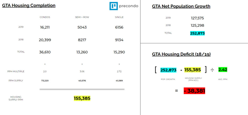
Simply put: in 2018 and in 2019 we built enough housing in the GTA to accommodate a population increase, and satisfy the demand of an additional 155,385 residents.
However, in the same period of time, we saw our net immigration inflow exceed 252,873 new residents.
Toronto is in a housing crisis, and we have been in some time. We’re in a supply crisis, or a demand crisis depending on how you look at it. Watch this video for a full summary.
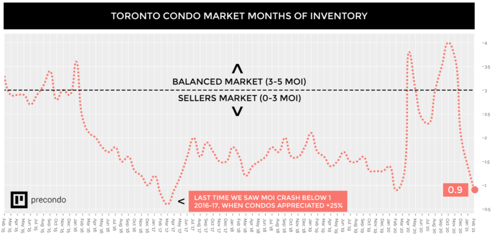
3. Historical Toronto Housing Price vs Months of Inventory Chart
In real estate market, we have a convenient little metric called Months of Inventory. It’s exactly what it sounds like – a measurement of how much inventory is on the market, and how quickly it’s selling.
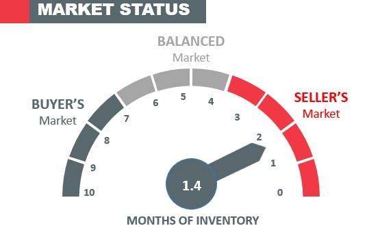
To put it in perspective: if the market sees 1000 new listings each month, and each month 250 listings sell, you have 4 months of inventory.
1000 Listings / 250 Sales = 4 Months of inventory.
Under 4 months is a Seller’s Market – Prices increase
Over 7 months is a Buyer’s market – Prices stagnate or decrease
It’s simple to understand, and it’s the perfect metric to look at versus historical prices to understand how supply and demand affect the market in real-time.
Below is a graph showing detached average house price in Toronto + months of inventory
You’ll notice that months of inventory inversely correlates directly with average price. When we see months of inventory spike, we see home prices dip, and vice versa.
Clearly – right at the time of the Fair Housing Plan, and shortly after the Stress Test, we see the detached home price in the Greater Toronto area market swing very quickly from 1 month of inventory to 3-4 months of inventory.
The detached buyer pool halved, literally overnight, causing that sharp decline in prices.
Here’s what happened with condo property type prices & inventory during the same timeline.
4. The Mortgage Stress Test Impact
The Mortgage stress test bit a 20% chunk out of your buying power with higher qualification standards – that’s a ton. It impacted the detached market negatively, and the condo market positively.
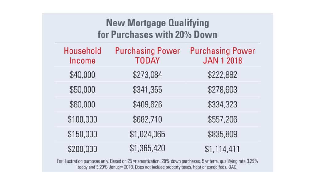
At a household income of $150,000, you’d be qualified for a $1M detached home prior to the stress test.
After the stress test? $835K – you’re now in the condo market, or you’re looking at a much longer commute.
The stress test was introduced to cool the housing market. The intention was actually to help out first-time buyers but it did the opposite. (2) Not only did it make it much harder to qualify for a mortgage as a first-time buyer with no existing home equity, but it also increased the demand in the Condo market, which is where most first-time buyers are looking.
5. Detached Home Prices in 2019

It’s fairly self-evident that the Stress Test & Housing plan triggered the detached price regression. With that said, the condo-to-detached price gap had grown to nearly 2.5X. So, it makes a lot of sense that the condo market cruised through it. Depending on the property type, there is a huge difference.
When you look at Toronto’s housing price history, or New York’s for that matter, you’ll find that two is the magic number for the condo-to-detached price multiple.
Meaning if the average condo will run you $500,000, the average detached should cost around ~$1,000,000.
For much of our history, that’s where the multiple was. Between 2013 and 2016, the detached housing craze hit. The increase in demand caused the detached prices to inflate rapidly, while the Condo market appreciated at the normal historical 5-6%.
Before long, the median multiple was 2.5X, making condos an exceptional deal.
Shortly after the stress test, which effectively reduced buying power of the marginal detached buyer by up to 20%, we saw detached prices correct downwards across the GTA. At the same time, we saw condo prices in the GTA rise by 15-25%, because they were now the most affordable entry into the market
Guess what? The effects of Covid have drummed up a similar situation in the pricing gap between detached homes and condos in Toronto – so we’re right back where we were pre-stress test. Once again, condos are in a ripe position for a strong run.
The current average detached price in Toronto as of June 2022 is $2M, while the average condo price is $700K – meaning we have a $1.3M gap between the two.
What Caused Toronto’s Housing Supply Shortage?
I’ve heard the line “the government needs to do something about this” a few times when discussing the rapid appreciation in Toronto.
Well, they tried – and they failed, twice. The government is not the answer. If anything, less Government regulation is a part of the answer to improving the supply side of the equation.
Why do we only deliver 35,000 homes per year if we could easily sell 50,000? The reason is not because the developers don’t want to – it’s because they can’t afford to.
In Ontario, and Toronto especially, we have one of the most expensive, lengthy & arduous condo approval processes. It can take 2 to 5 years in many cases for a Developer to go from purchasing a piece of land to getting construction started.
In addition, the city has raised developmental charges by nearly 300% in the past 5 years. This will be felt by buyers in real estate market.
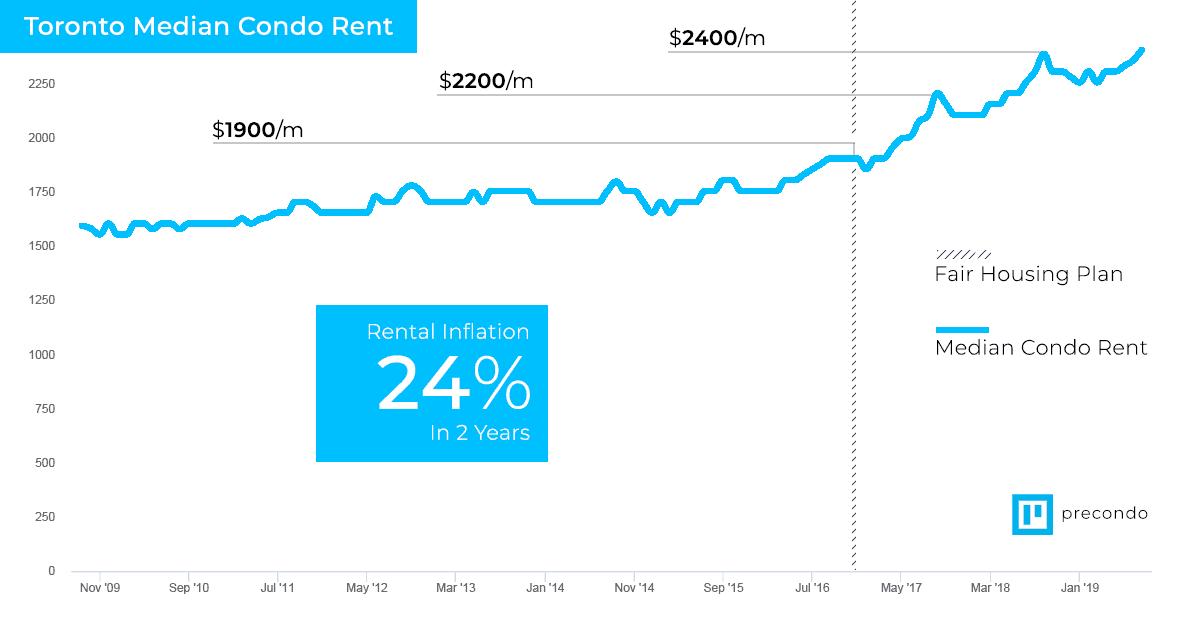
The fair housing plan is a great example of why the Government should not meddle in the market. The primary goal of the fair housing plan was to slow the rental rate inflation in Toronto by slapping rental controls on Landlords. The result was the exact opposite of the intention – median condo rental rates in Toronto increased by 25% in two years.
To be ahead of any news, updates, and upcoming condo listings in Toronto, visit our website for more information.
References:
1. Ontario News, Ontario’s Fair Housing Plan, retrieved from https://news.ontario.ca/mof/en/2017/04/ontarios-fair-housing-plan.html
2. Tess Kalinowski, Is the mortgage stress test making Toronto’s housing crisis worse?, retrieved from https://www.thestar.com/business/2019/06/10/is-the-mortgage-stress-test-making-torontos-housing-crisis-worse.html
What a great well thought out report. I think you hit it spot on with home construction versus the people coming to the city. I think the GTA will be it’s own beast it will always be a pricey city to live in. I like your thoughts on the fair housing plan. Unfortunately we will probably only see more regulation as the masses always want answers.
Great analysis. One question: shouldn’t you convert the number of newcomers to equate to households. Certainly some live alone, but most people I know do not. Would it be more reasonable to halve the number of newcomers to equate to households? I’m sure Stats Canada has some average value that would be more representative than assuming every newcomer would live in their own household.
Hi Linda!
Fantastic point and you’re right – absolutely a data point that I should have quantified.
For reference, currently, the average condominium occupancy in Toronto is 1.5.
Average freehold occupancy is 1.7.
Cheers,
Jordon